I will not be giving you props for your work on this movie. I understand the buck doesn’t stop with you (in fact, as a buyer, it starts with you), but someone in the art department really should have cared more about how a downsized world should look. Far too many times sloppy decisions were allowed through the cracks. Writer/Director Alexander Payne is nothing if not an expert in tone and handling multiple complex human emotions, but when it comes to production design… well let’s just say, I’ve never longed for a movie to be directed by Tim Burton in my life. Until now.
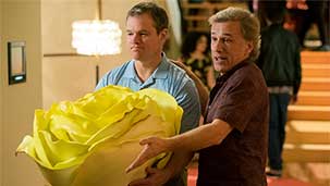
The first hour of Downsizing didn’t make me feel this way. Payne takes a big swing at a high concept in this film, where certain environmentally (and fiscally) conscious members of society decide to scale down, swapping feet for inches. And as we see the first 5-6 inch people walk around and extol the virtues of life on the small side, the film seems to be building strong and layered metaphors. I was excited to imagine all the possibilities and complications of what it would be mean to literally shrink our footprint on the earth - especially to transition into this approach. And the story does touch on some of these issues with intriguing details. But that’s conceptually. When Matt Damon’s character finally decides to undergo the procedure and wakes up in the operating room, it didn’t take long for the spell to be broken.
It was the knobs. The knobs knocked me out of it.
Out of all the aesthetic decisions that could have been used in a medical facility, for some reason your team decided to put wood knobs on the bed posts. So what, right? Well the wood grain, for starters. No consideration seemed to have been paid to how wood grain would look from that perspective (ie, much thicker lines). And then I noticed wood all around the room. Same thing. The film makes explicit that the science doesn’t shrink objects (hence why they need to remove fillings from people’s mouths before undergoing the procedure), but no one in the art department seems to have taken the cue. Don’t even get me started on the rain, which from that perspective (and the rate it falls at one point) should have been enough to almost knock people off balance. Instead it was just, you know, rain. Volume and distance between drops, no different than another other falling water. Honey, I Shrunk the Kids did a better job than this.
I would have been happy to overlook, or at least forgive, these types of details if the film had lived up to its own promise. But by the time the story hits the midpoint and decides to take a left turn into some heavy-handed moralizing about the disenfranchised, the film had lost track of a lot more than just the props department. Suddenly the least interesting threads were being followed, and much like the characters themselves, the larger world was allowed to slip away. It feels like a really long way to go just to parallel how much the world is still like ours.
Maybe you bought it, but I didn’t.
Sincerely,
Christopher